ABOUT THE PROJECT
Arkeo is a boutique architecture and interior design studio specializing in residential and commercial spaces that balance functional precision with artistic expression. The brief called for a complete brand identity system that would reflect the studio's philosophy of structured beauty — designs that are rigorous in their logic but warm and human in their feeling.
The project encompassed the full spectrum of brand identity work, from naming refinement and logo design through to a comprehensive visual system covering typography, color, texture, stationery, digital applications, and motion branding elements for use across presentations and social platforms.
THE CHALLENGE
Structure as aesthetic, warmth as philosophy
Synthesizing highly technical, abstract, and hazardous industrial concepts such as installing lightning protection systems within volatile refinery zones into clear, engaging, and compliant creative assets for jury evaluation..
Key challenges included:
Defining a visual language that communicated both rigor and warmth
Creating a logo mark adaptable across digital and physical applications
Building a color and texture system with clear architectural references
Developing motion identity elements for digital brand touchpoints
Ensuring the system felt premium without becoming inaccessible
OUR APPROACH
Systematic Conceptual Visualization And Multidisciplinary Design
Developing a robust pipeline that bridges raw engineering with premium digital media. We collaborated closely with technical teams to draft conceptual storyboards, modeled anatomically accurate 3D industrial assets, and animated fluid motion sequences to demonstrate the real-world mechanics of each innovation.


VISUAL DIRECTION
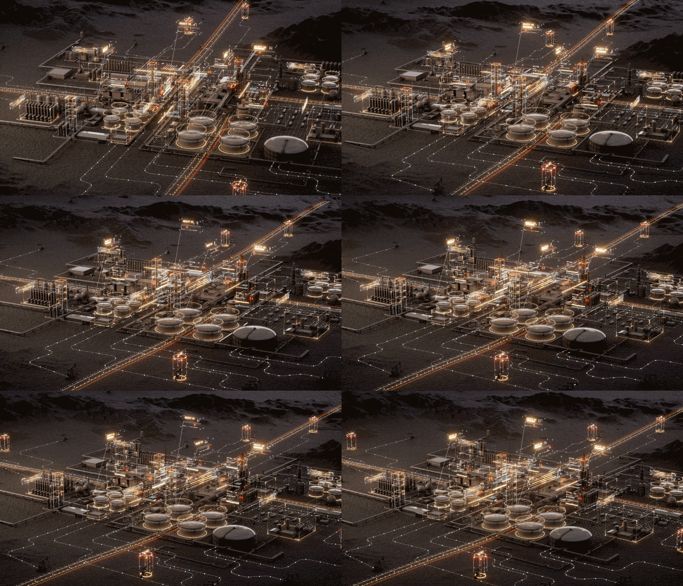
The visual direction focuses on professional technical fidelity and engineering precision, using an immersive 3D style. The creative language centers on 'High-Fidelity Industrial Aesthetics,' where complex engineering models, such as lightning protection systems, are rendered in semi-realistic detail. The textures are metallic and functional, emphasizing performance, while soft, sophisticated studio lighting highlights geometric precision. Transitions are clean and methodical, mirroring the orderly progression of an innovation presentation.

DESIGN SYSTEM
A structured industrial asset framework was developed to maintain technical accuracy and visual prestige.
Core elements included:
Technical Typography: Clear sans-serif fonts suitable for schematics, technical data labels, and commercial justifications.
Component Library: Standardized, photorealistic 3D models of refinery components, pipelines, specialized safety gear, and industrial signage.
Lighting Master: A uniform virtual studio setup to provide consistent high-quality lighting across all technical models and animations.
Animation Sequence Master: templates for animating technical functions, such as flow simulations or impact visualizations.
FINAL SOLUTION
A premium visual advocate for operational innovation
The final solution successfully elevates abstract operational ideas into persuasive, high-value visual arguments. By translating complex engineering breakthroughs into compelling 3D assets and fluid animations, the deliverables provided competing teams with a decisive advantage. The APQ Award jury could immediately understand and validate the mechanical and commercial viability of each safety innovation, setting a new benchmark for technical presentation within Pertamina.